Now we have completed the music video task I thought it would be good to look back at the initial storyboard I created to see how we developed our ideas from this and how things changed slightly.
So the first shot was planned to be of the artist. This was kept as it introduces the artist nicely.
The 2nd shot was to be the couple walking down the stairs together. The 2nd shot is now a landscape shot which pans up into the sky to set the romantic setting, however as it pans up it sets a quite spooky sky scene.
So the third shot is just the same as the original storyboard as it is of the stairs however after this it is the couple on the stairs and then cross dissolves into the actor on his own. This is because we developed our original idea to a more bold and unique idea/look.
After this on the story board there was supposed to be the shot of the guy with the cards. We kept this the same as we thought this would show the guy reminising well.
After this was planned to be a close up of the artist however as I developed our ideas and got rough cut feedback from our teachers they liked the memory concept and thought we should show this as much as possible, therefore because of this we decided to add more memories scenes of the couple together and apart. So this is what I done.
You can see the colour contrast between the two scenes. We used this idea to show the mood of the scenes. So going from happy to sad and lonely.
To show the guy reminising and remembering his girlfriend I came up with the idea of using candles to symbolise this instead of having a shot of the couple in the forest as planned due to the fact I thought the symbolism of candles is much stronger.
Next was supposed to be a montage of the couple. However when getting to know the song pace more I felt as if a montage wouldn't work well and therefore I decided to keep with the pace of using a slower clip of the guy lonely.
This clip was supposed to be of the guy walking past the form and looking out for the girl however once I had analysed the timings of the song this was a perfect time to re shot the artist and have her lip syncing, as this is a crucial convention of a music video.
Because we just showed the artist I didn't think it would look right if I had faded it back into the artist and therefore chose to show a new memory.
Next was suppose to be a clip of the forest again however as we hadn't used this previously I decided to use the candles clip instead to use this over and over to show the rememberance theme.
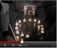
Which then fades into a photo frame to show notions of looking.
Here was supposed to be a shot of the artist however due to our teachers saying focus on the memory aspect. I decided to use a romantic location of the couple together and then show the guy angry when the girl is no longer there.
I then decided to show the artist as she hadn't been seen in quite a while so I thought it was neccesary.
Here was supposed to be a montage however as before the pace of the song wouldn't suit the montage so therefore I used the forest idea which gives it a romantic secret feel.
I then shot the artist again just as originally planned in the storyboard.
Here was planned to be a montage again however I decided again not to include this so instead would reinforce the rememberance aspect, which works really well. After this was a shot of the candles all blown out due to the fact the pace of the song went quite dramatic.
Here was supposed to be the cards and then the artist lip syncing next, however this wouldn't work with the song timing as the chorus started here so therefore I had the shot of the artist here instead.
Here was supposed to be the couple on the bench however it then changed as I didn't feel as if a bench would be too much of a romantic setting so I developed it to a walk along the river.
It was planned to be the artist here to finish the song however when analysing the song properly I realised that the initial timings were wrong as the song hadn't finished. Therefore I decided to reinforce the notions of looking theory of Goodwins with the photo frames.
Here is another memory aspect in a romantic setting as this was our main concept. I broke the scenes up nicely by fading the couple together in bright colours with a vignette into a clip of the actor alone with a very dull mood.
It then goes back to need to sell the artist so a nice clip of the artist was shown.
Which then goes back to the photo frame aspect of memories.
From our teacher feedback I learnt how to use cross dissolve and therefore used this with lots of photo to give a nice memory feel.
It then goes to the haunted look of the thought of the guy being watched by the girl ghost. Which gives notions of looking again.
Then is a clip of the artist walking down the stairs to fit the lyrics.
To end the video is a nice romantic shot of the couple next to the sunset.
So in conclusion I used my research very well to develop my ideas and concept from my original ideas from my storyboard.
Thursday, 15 December 2011
Looking Back At The StoryBoard
Wednesday, 14 December 2011
Final Cut Transition Research
A transition is the visual effect that is used to carry along or to change the transition between two clips or images. I researched the basic transitional effects – at the start of the project - of Final Cut and listed them below.
3D Simulations
These transitions are Cross Zoom, Cube Spin, Spin 3D, Spinback 3D, Swing, and Zoom. They are used to create a large impact between clips, to catch the attention or to give off a somewhat futuristic or humorous feel to the audience. Such a transition style would not be suitable for our music video as it is too bold and would ruin the emotion we are trying to create.
Dissolves
These transitions are Additive dissolve, Cross dissolve, Dither dissolve, Fade In, Fade Out, Non-Additive dissolve, and Ripple dissolve. Dissolve is the most commonly used transition. These transitions morph the image into something else by gradually erasing what was there before hand.
Page Peel
Page peel is literally as its name states, the first clip feels away like a page to reveal the second clip. Such an effect could possibly be used in conjunction with the “memories” theme however it is still a little too bold to be placed within our video.
QuickTime
The 13 QuickTime transitions are Alpha Compositor, Chroma Key, Cross Fade, Explode, Gradient wipe, Implode, Iris, Matrix wipe, Push, Radial, Slide, Wipe, and Zoom. QuickTime has its own selection on effects. Cross fades are used in out video to create a soft yet ghostly effect between clips. Other transitions however are a little too overpowering to be used.
Slide
These transitions are Band slide, Box slide, Center Split slide, Multi-Spin slide, Push slide, Spin slide, Split slide, and Swap slide.
Stretch and Squeeze
These transitions are Cross Stretch, Squeeze, Squeeze and Stretch, and Stretch.
Using these transitions makes the clips look rather distorted, so would be inappropriate to use in such a serious and deep meaning video, as they will stretch the faces and backgrounds of clips to something bizarre.
Wipe
These transitions include Band wipe, Center wipe, Checker wipe, Checkerboard wipe, Clock wipe, Edge wipe, Gradient wipe, Inset wipe, Jaws wipe, Random Edge wipe, V wipe, Venetian Blind wipe, Wrap wipe, and Zigzag wipe. Wipes are different to dissolves as they do not blend in the transition process. Although they are not as subtle as dissolves, so would not be suitable for our video. Wipes are often used in family memory or home video editing, again as they provide a somewhat comic aspect.
Music Video Research
Music Video research:
The first video I looked at was “Memories” by Within Temptation. Dissimilar to the band’s usual rock based music, this song was rather slow in comparison and filled with deep meaning. The song is about looking back to the past with hints of loss and regret with the imagery of faded reflections in the mirror and a ghost like presence in both the video and the lyrics. In comparison to our own music video, the piece has been saturated to give it a dramatic and emotional feel, is story lined based and has a gothic quality to it. “Memories” however features the artist a lot more often than in our own video, is of a different genre and does not involve a couple particularly.
The second video I looked at was “Almost Lover” by A Fine Frenzy. This video is based around the loss of a love, similar to our own music video. It also includes elements of memories and looking back to the past, as if the woman’s lover had died for some reason. This feel is mirrored in our own music video project, but it is portrayed differently. There is so differentiation between the past and the present; all the clips are actually rather bright which gives a lighter sense to the video. This matches the lyrics; “I never want to see you unhappy”. The video overall has a very home-movie feel to it which, after reading feedback, is similar to our own video, but “Almost Lover” shows only one half of the couple and not the man. Furthermore the singer acts the woman of the couple, whereas in our video I played the artist and Nicola was the actress.
The third video I researched was “Reila” from the Japanese band The GazettE. Although the video is, of course, in Japanese I discovered many reasons as to why it is relevant to analyse in contrast to our own music video. The song and video again reflect a feeling of lost love and looking back to the past, reliving memories – shown by the girl looking back to her childhood, wishing to be a ballerina. The lyrics “Reila... Even if I try to call out your name, this voice does not reach you...” reflect this notion. The saturation of the video and the transitions used are also very similar to that of our own music video, as well as the pace of the song (despite being rock) and the haunting aspect of the video. The imagery of death and mourning is also used in the video, when Ruki – the singer - places flowers over the body towards the end of the piece. However the video is rather different to ours as the artists, particularly Ruki, are shown throughout most of the video and the pace of editing is much faster.
The fourth video I looked at was another by The GazettE, called “Pledge.” Rather different from the previous, this video was much slower paced and less dramatic in costume and imagery. The entirety of the video is in black and white, giving a very dramatic yet cold look to the video but the band are features less to give way to the actors performing the main story line of the video. Again it gives a sense of lost love and regret, especially with the imagery of tears and rain, and lyrics such as “Our hearts must know the meaning of losing each other”. Raw emotion is also shown more on Ruki’s face as he sang, which I tried to mimic in my own lip-synching performance in our video. The pace of editing has also slowed down slightly to match in with the feel of the song.
Goodwins Analysis of "Beyonce - Love on Top"
So to begin with the first point of Goodwins theory is: "Music videos demonstrate genre characteristics (e.g. stage performance in metal video, dance routine for boy/girl band).
" So within this video there is a dance routine throughout so this video is very genre specific. The next point of Goodwins theory is: "There is a relationship between lyrics and visuals (either illustrative, amplifying, contradicting)." There is a vague link between these for example: 'I can see the stars all the way from here" at this shot she moved her hands to suggest stars so it is vaguely illustrative.
The next point is "There is a relationship between music and visuals (either illustrative, amplifying, contradicting)." The music pace fits the visuals throughout as the dance routine speeds up when the song does etc.
"The demands of the record label will include the need for lots of close ups of the artist and the artist may develop motifs which recur across their work (a visual style)." There is shots of the artist throughout with several close ups so this shows that they have used need to sell the artist. So the visual style this creates for Beyonce is that the focus is on her in this video with no narrative.
"There is frequently reference to notion of looking (screens within screens, telescopes, etc) and particularly voyeuristic treatment of the female body." For this point it is present as there is voyeuristic treatment of Beyonce throughout the video due to the fact of her outfit and her dancing throughout the video.
The last point of Goodwins Theory is "There is often intertextual reference (to films, tv programmes, other music videos etc)." There is no clear link to us of intertextual reference.
MTV Task
After watching the five nominees videos we feel as if the winner should have been Katy Perry with her song ‘firework’. This is for many reasons.
For example the genre characteristics are shown through the dance routine at the end of the video. The Mise-en-scene reflects the genre of pop due to the bright colours shown and the carefully chosen outfits. The lighting is always bright so this shows the genre because it helps to emphasise the positive connotations. Also the pace of the song highlights the pop genre as it’s quite upbeat. There are special effects within this video when the fireworks are shown. This shows the pop genre as bright colours are shown to light up the sky.
There is a strong link between the lyrics and the visuals. For example when the lyrics ‘there’s a chance for you’ are sung you see a boy suffering from cancer, so it’s as if she’s singing to him to give him self-confidence. Another strong example was when the lyrics ‘come on show ‘em what your worth’ this is when you see a boy trying to stop the violent argument between his parents so it’s as if she’s telling him to stand up for what he feels.
The music pace always matches the visuals. Within the verses the pace is much slower so it puts the point of the lyrics across which is emphasised because the chorus of the ‘fireworks’ is uplifting.
There are quite a few close ups to put across Katy Perry’s facial expression as that portrays the mood of the lyrics.
There is a vague amount of Intertextuality when the dance routine is shown at the end as it crosslink’s to the film Fame.
Overall we thought this video was the best because it had a meaning to it. Compared to the other videos, which were just natural or voyeurism to the females’ body.
By Nicola Gutteridge and
Abi Gourlay
Mercury Music Prize Task
GhostPoet
How do their clothes, hair, accessories, shoes influence your impression of them?
In the promotional image we studied we decided his clothes were smart/casual and quite basic so therefore this gives us the impression that he’s just an average man. He always wears a hat so this gives us the impression that this is the smart element in combination with his shoes. His expressions are always very serious which reflects that his lyrics will be quite meaningful and serious.
Can you tell what genre of music they make by the image?
Initially we thought that he would fit into the reggae/soul music genre due to the style/look he portrays. However we didn’t have a strong feeling about him fitting into this category. So we think he might be apart of a hybrid genre.
What does the composition of the image tell you about the artist?
The colours are quite washed out and simple. The lightings quite natural but its only on one side. So it reflects his mood and again empathising that he’s quite a serious guy. There are no props so this shows he’s the main focus and he likes to be basic and have the focus on the music. He’s positioned in the centre of the frame, which shows us that he’s the focus. He’s standing naturally so therefore he’s just an everyday guy who doesn’t care about his image, as he’s just got a passion for his music. The location is as if he’s in a college with a chalkboard behind. The chalkboard includes writing/scribbles, which are crossed out. This gives us the impression that he’s made mistakes in his past and his lyrics will reflect this.
Analysis of Music Video against Goodwins theory
From watching the video we realised that he doesn’t have any bold genre characteristics so this shows us that he falls in and out of different genres. An example of this is he vaguely shows rap characteristics as the focus is of him and his lyrics with no dance routines. The lyrics and visuals have a strong link throughout the music video. As the visuals are quite dark/dull this reflect his lyrics of the song as they are quite strong and on about surviving in a world that has cutbacks and conditions which are tough.
Also it gives us the impression that he’s had a tough past. The link between the music and visuals are that they are both very basic so that you focus on the lyrics. It shows the emotion of the song by the simplicity of both the visuals and the music. Their weren’t many close ups of the artist although he was always on the screen. This shows he doesn’t want to be the centre of the attention, as he isn’t trying to enhance his image. Due to the fact he fits vaguely into the rap genre there is no voyeurism. This is because again the focus is always the lyrics. There are no signs of intertextuality as the video is very basic.
After watching the music video we were surprised. This is because we thought it would be more upbeat and lively. And include more than just him. We also expected the lyrics to be quite short and snappy so they would be catchy, however this wasn’t present.
Biography
The artists name is Obaro Ejimiwe and he has been in the industry since 2006. He works for Brownswood Recordings UK.
Labels:
Abi Gourlay,
Chloe Housden,
Nicola Gutteridge
Word Justification
Here is our word justification for the the artist construction task.
The location we have chosen will be by one of the trees within the Long Road site. We have chosen to use this location because it’s quite simple so therefore the attention and focus will be on the artist. The image we are trying to create is a punk/rock image. So this will include bright colours, a bold outfit, outrageous hair and a simple location so therefore the focus is on the artist. We have decided the artist will be just to the right of the frame and it will be a long shot so that the audience can see the artist clearly. The outfit will be a punk styled dress, tights and shorts. We have chose this as then it will clearly reflect the genre of punk. As we are trying to show the punk genre the artists’ hair will be quite messy and eye catching. We have chosen not to use any props as we looked at existing punk album covers and props generally aren’t used. We have also decided that in Photoshop we will turn the image to black and white with a bit of colour in the title and the artist. The colour theme will be quite bold but not varied so they are striking yet quite dull too. We feel as if this will put the image across to the audience that our artist fits into the punk genre. Overall the image we are trying to create will be to reflect the punk genre. From looking at examples of punk bands the image is to reflect the genre not the song, so therefore we will be aware of this when putting our poster together. The image overall will be quite simple however the thing which will make it stand out will be the artist due to the artist being in colour with the background dull. We think this will work well to sell the artist, as the audience will see that being comfortable in your own style is okay.
Labels:
Abi Gourlay,
Chloe Housden,
Nicola Gutteridge
Subscribe to:
Posts (Atom)