Goodwins Points - The lyrics matched the visuals which was good as the song has a strong meaning.
- There was no intertextuality but this did not matter as the song is not commercial.
- The music did not match the visuals although the cuts were in time with the music.
- The genre chracteristics were there as the video showed the artist a lot.
- We saw the artist through a camera style showing which worked for the song.
Mise - en - scene - The costumes were basic which was good as it gave a natural feeling to the video. The locations were romantic and as a result matched with the lyrics. The lighting was effective as it created a ghostly feel. To improve, there could have been more extreme acting like when the male character violently chucks a rock off the bridge. The props were varied which was good but maybe too many were used.
Editing - The editing was effective as it was clear and natural but gav a ghostly feel. However there could have been more cuts as some shots were a little bit too long.
Camera work- The camera work was good as there was a variety of shots so the viewer did not get bored. Good use of extreme long shots and close ups, however some clips were too long.
The overall idea was effective and the acting was convincing. To improve, the artist could have been as emotional as the couple but apart from that it is a good performance.
Sunday, 27 November 2011
Thursday, 24 November 2011


Creation of our magazine advert
After creating our digipak and the haunted theme working we decided to carry on with this in our magazine advert.
So we used our second tree/natural shot for the background and made that black and white, and then played around with the hue/saturation, as well as the brightness and contrast. When we had completed this we then layered it with the second image of the couple and made that black and white. We then changed the opacity so it looked haunted/spooky, we also used the filter 'linear dodge add' to make it more visible and haunted of the couple.
To make it a bit more different from the digipak we layered these with 'parchment' texture layer which makes it more unique so therefore it will capture the attention of our audiences as well as making the couple more visible.
So in both our digipak and magazine advert there is an image of either the artist or the couple which has been faded in by the opacity which means you have to look closely to see like a magic eye.
Digipak Creation
The image I have chosen to use for part of my digipak is the one below, this is due to the fact this image needs to sell the album instead of just our video single. Therefore I decided if we have the image without the couple then it will sell the overall album instead of just the single.

I then added a new adjustment layer of black and white.

After adjusting the reds,yellows,greens,cyans,blues and magentas I then added another adjustment layer for the hue and saturation and altered this to what I wanted it to be.

 So from this I have the main image of my digipak done. After this all I have to do is add the image of Abi in the background and change the opacity, and burn the edges in.

I then added a new adjustment layer of black and white.

After adjusting the reds,yellows,greens,cyans,blues and magentas I then added another adjustment layer for the hue and saturation and altered this to what I wanted it to be.


Wednesday, 23 November 2011
Mise-en-scene research for digipak and magazine advert
Before putting the image on my digipak I decided to have a look at rihannas videos, to see what sort of theme and style of videos she has.
From this I found that she always has a narrative to her videos. After seeing this video 'Paranoid' it inspired me to go down the route of 'old horror movie' themes.
So therefore instead of going for the obvious digipak image with the couple. I decided to use the blank tree shot and then layer the artist on top and change the opacity so she looks ghost like.
This will allow me to capture the audience for the whole album instead of just basing it on the couple of the haunted single.
From watching this video I also saw that mise-en-scene will be the creative key to the success of our product. For example we will have to be aware of the colours we will be using (black and white being dominant), we will consider the brightness of the overall package so as we used natural lighting it will be quite easy to play around with the brightness and contrast. So we will be using (Low key lighting) as this is the effect they use in horror movies to have areas of dark and light within the frame. We have already thought of the costume to be simple when taking the image. And the location was taken due to the romantic feel however when editing the photo we will make the tree look all dark and gloomy to give the scary haunted feel.
So overall from watching this video I have the idea of the mise-en-scene for both our digipak and magazine advert to make them part of a successful package which reflects our scary, gloomy, haunted concept with memories from the past.
Tuesday, 22 November 2011
Font Styles
For our digipak and magazine advert I feel as if we don't need any fancy style of text due to the fact we will be putting a filter on to create the haunted aspect. And for the remaining text for example 'Rihanna' it will be simple yet bold so it is clear to the audience so it will capture their attention instantly as its bold and easy to read.
 So I went on a font website in order to get a feel for the possible font. I then took a screenshot of the style of text we will be using to show the style I think will work well. So the text to left shows you the simplicity of the text yet its great as it stands out and it's easy to read.

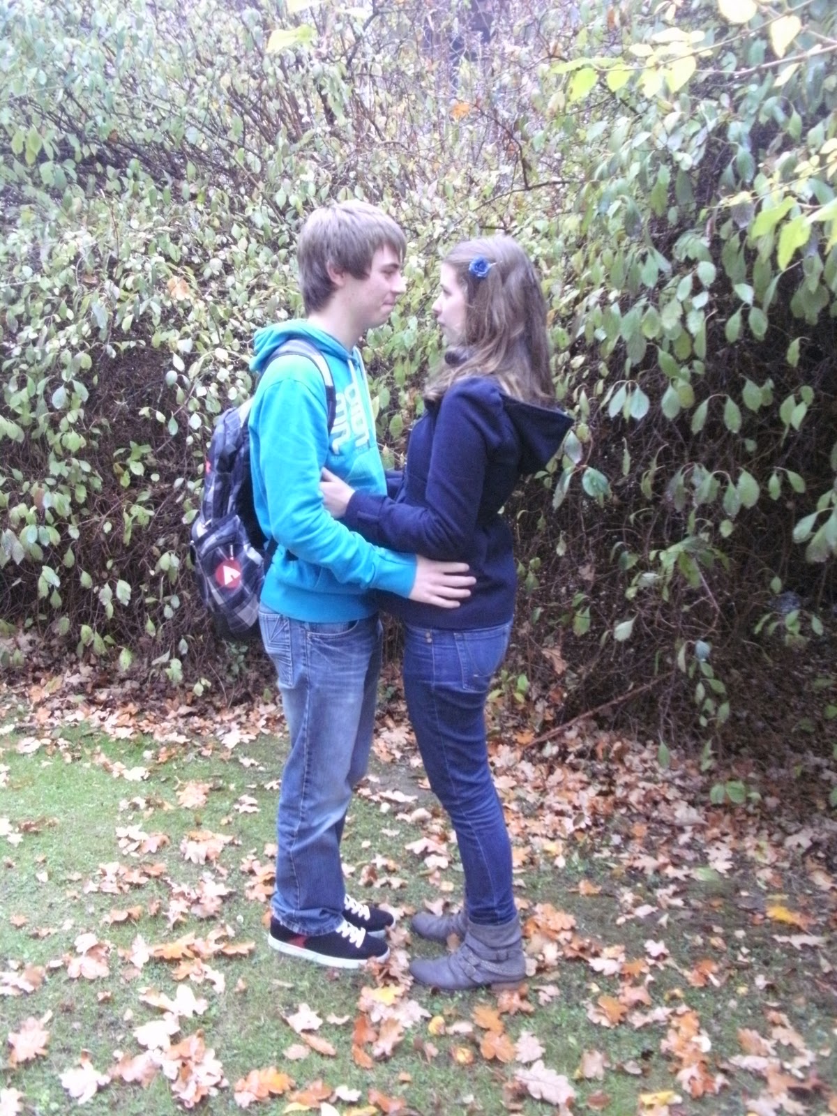
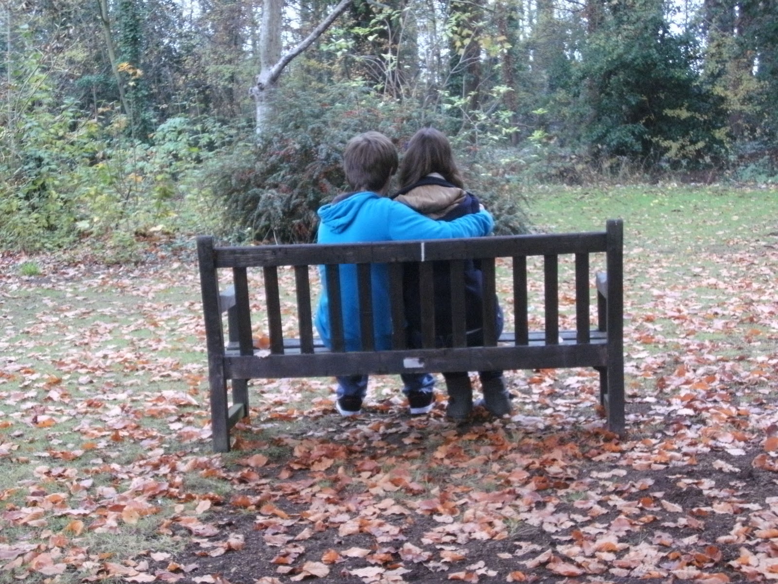
photoshoot
Here are the images which I took today of Chris and I for our magazine advert and digipak, they were taken on self timer due to no-one turning up to be able to take them.


Things to include on a Digipak
+ The name of the artist has to be highlighted and the main focus if the artist has there back to the camera or only has a small part of them seem.
+ Certification of video
+ Release date
+ Ratings from a magazine
+ Record Labelling
+ DVD logo
+ Track Listing
+ Bonus features/extra info
+ website addresses
+ Bar Coding
+ Certification of video
+ Release date
+ Ratings from a magazine
+ Record Labelling
+ DVD logo
+ Track Listing
+ Bonus features/extra info
+ website addresses
+ Bar Coding
Conventions of a Magazine Advert
+ The Name of the Artist
+ The Name of the Album
+ The Release DateWebsite and Myspace addresses
+ Reviews and Ratings of the Album
+ Record Label Branding
What fans expect (Our genres typical conventions)
I decided to research Rihannas videos in order to get a feel of what our audience will expect from this.
Rihanna - 'unfaithful', then 'we found love', then 'only girl in the world'
From watching these videos you can see that the audience will expect to see:
+ a storyline
+ a variety of shot types
+ clips vary in brightness/contrast
+ good lip syncing
+ shots of the artist.
+ actors and actresses
Rihanna - 'unfaithful', then 'we found love', then 'only girl in the world'
From watching these videos you can see that the audience will expect to see:
+ a storyline
+ a variety of shot types
+ clips vary in brightness/contrast
+ good lip syncing
+ shots of the artist.
+ actors and actresses
Monday, 21 November 2011
Research of Track Listing and Our Official Track Listing for our Digipak

The first album I looked at was Leona Lewis 'Spirit'. I chose this album as it fits into the genre of our song. From reading the track listing it showed me that all the songs link into the album name 'spirit' and overall they all link together on the love concept and spirits.

So from this research I knew that the track listings should fit around the 'haunted' theme. So from this I created the following track listing for our digipak:
1) Haunted (intro)
2) Haunted
3) Memories
4) Ghost from the past
5) The friend you never had
6) Playing with hearts
7) You brought out the best in me
8) Never forgotten
I feel as if they all link together well and suit the artist image I have created.
Magazine Advert Layout

Digipak Layout

Lighting Research
Overall we were going for the natural and realistic look, so therefore from this we didn't really need to research lighting methods due to the fact we wouldn't be using anything but natural daylight. However I will make sure I am aware of how the lighting will fall throughout the frame to make sure it looks great and enhances the shots.
 So despite the subject matter being wrong, the natural light will be like this and then during the editing stage I can then edit with different types of filters.

Thursday, 17 November 2011
Wednesday, 16 November 2011
Star Analysis
I have chosen to analyse Lady Gaga and her videos to see how their videos sell to their artist.
So I will start off with the beginning of her career with the song 'Just Dance'. This video was very successful with the wacky storyline, close ups of Lady Gaga, very up beat track with quick jump cuts. It had no major production however dance routines were present as it was set at a party so therefore was still upbeat and alot of dancing and voyeurism of the female body.
Moving onto 'Poker Face'. This video included mainly shots of Lady Gaga herself in wacky outfits, so therefore this is how this video enticed the audience. As well as this the way the video has been edited making it unusual helps to sell this video.
Finally a more recent video 'Bad Romance'. This again included lots of shots of Lady Gaga with wacky outfits, edited very uniquely to entice the audience and jump cuts. And in this video it includes a major production with dance routines.
So therefore overall as time as gone on she uses many of the same techniques however as you go along the timeline the bigger the production and dance routine. So there is many techniques which Lady Gaga uses in order to sell her videos to her target audience.


Editing


In this clip it goes from being colour corrected to being very bright and saturated, with a vignette. Which then goes to the clip of the guy on his own in black and white due to colour corrector.
Editing


Editing

Editing

Editing

Editing

I will be using this technique alot as its a nice transition to use to split up the past and present.
Editing

Editing Process

Analysis of other students digipaks
After researching the digipaks of other students, i have found out a lot of key details which are all good ideas for us to add to our own digipak. One thing i noticed is that most of the past students used themes from their music video within their digipak for example having the same character featuring on the digipak with the same outfit, at the same place and with the same emotions and expressions. They also follow themes of props by focusing the cover of the digipak with a picture of a main prop that features in the music video or even just a picture of the place where the music video was filmed.
Another important aspect to add to our digipak is information such as the release date, ratings, the price, quotes from magazines or celebrities, the name of the artist, song anfd album and images.
Another important aspect to add to our digipak is information such as the release date, ratings, the price, quotes from magazines or celebrities, the name of the artist, song anfd album and images.
Existing DigiPak

The next convention is that there should be a track listing. Which is present on the back of the digipak which is. There should be website and myspace addresses which are also present on the back of the cover in the yellow text box at the bottom.
The record labelling is also in the yellow text box at the back of the album.
And finally their should be pictures of band members of relevant visual imagery. Which is also present as there is an image on both the front and back of the artist.
Examples of a students magazine advert with all the conventions.

For example it should include the name of the artist and the name of the album, in which it does as as it states these at the top of the page.
The next convention is to have the release date which is also present as it states 'out 16th November'.
Another convention is that it should include URLs'. In which it does again as it has 'amazon.com'
After this is should include reviews and ratings of the album. Which is present at the bottom of the student magazine advert. The record labelling is also at the bottom right of the advert.
And finally it should have relevant visual imagery which links to the digipack. which again it does.
Analysis of Existing Magazine Advert

I love the way the image has being manipulated so that the opacity of the two characters represent the past and the present. And the subject matter reflects the emotion of the characters and the love they share. The way the top has been represented with the round circles fading together really works well to surround the image subtly. I feel as if we could use this technique really well too. The way the text has been shown 'GHOST THE MUSICAL' again represents the theme of the past and haunted by the blurred white style they have used against the image fading down to the black at the bottom. Again we could really use this technique to represent our haunted aspect.
The conventions of a magazine advert are the following: 'the name of the artist' so therefore in this case it is the title of the musical which is present. ' the release date' which is shown at the top as it states 'out tonight'.
'Website Addresses' should be present, and they are as it says 'ghostthemusical.com' and 'ticketmaster.co.uk'. Next reviews and ratings should be present however they aren't in this case due to it being a musical. In a music advert there should be a record labelling too. After this they should have visual imagery which they have with the two characters, and finally the image should be manipulated in some way which is shown as they have strongly manipulated this image to represent the Ghost theme of the musical.
In conclusion this is a very successful advert. And will help when creating ours as it shares the same theme which we are trying to represent. So we can use this to help us when creating ours as this is the technique we will need to use to represent our haunted theme just like they represented the ghost theme.
Compositon of Magazine Adverts
I'm going to look at the composition of this image by simply analysing the visuals. 
For example your eye is firstly drawn to the image of the couple due to the colour differientation and also you are drawn to the title 'Ghost' so they have clearly thought about the framing of this advert to ensure the first thing you see is there concept of the 'ghost'.
The image has been placed in the centre of the frame in order to capture your attention straight away and show the difference of the guy and the lady.
Everything is in the foreground in order to capture your attention and this works really well.
The photography is balanced as there is one of the people on each side.
The use of filters have shown a clear difference between the colours and this works really well.
Overall you can clearly see they have thought about the composition of this advert by making their concept stand out in the foreground, experimenting with colours and filters, framing the image in the centre etc.
Our Visual Theme
Throughout our video the narrative is all about the past memories of the couple. And the guy getting haunted with these memories because he can't let go of the past. Therefore this theme would clearly link our music video with our digi pack and our magazine advert. So because of this our theme will be memories and being haunted.
The colours we use will not be really bright as it is a really emotional song and therefore the colours will reflect the meaning of the song by being quite striking in the black and white being used, but overall the image shouldn't be really bright as it won't fit in with the song.
The colours we use will not be really bright as it is a really emotional song and therefore the colours will reflect the meaning of the song by being quite striking in the black and white being used, but overall the image shouldn't be really bright as it won't fit in with the song.
Monday, 14 November 2011
Research
Due to the fact we won't be editing extremely or using a wide range of special effects I didn't have to research the techniques I will be using as I already know how to do them. So the following techniques we will be using is:
+ colour corrector
+ Vignette
+ fade in/ fade out
+ cross dissolves
+ colour corrector
+ Vignette
+ fade in/ fade out
+ cross dissolves
Goodwins Theory Analysis on Students Work
+ Music videos demonstrate genre characteristics (e.g. stage performance in metal video, dance routine for boy/girl band).
There is no dance routine but it is genre specific with bright colours.+ There is a relationship between lyrics and visuals (either illustrative, amplifying, contradicting).
There is a vague link of the nerd needing to 'stop complaining'
+ There is a relationship between music and visuals (either illustrative, amplifying, contradicting).
There is a link between these so it is illustrative with the pace of the song matching the visuals
+ The demands of the record label will include the need for lots of close ups of the artist and the artist may develop motifs which recur across their work (a visual style).
There are lots of close ups and shots of the artist so there is a strong link of need to sell the artist. So there was a visual style of the nerd throughout.
+ There is frequently reference to notion of looking (screens within screens, telescopes, etc) and particularly voyeuristic treatment of the female body.
There isn't any notions of looking apart from the looking through the window and watching the nerd work in the classroom.

+ There is often intertextual reference (to films, tv programmes, other music videos etc).
There isn't really any interxtual reference but I feel as if this works due to the fact it looks unique and bold because of this.
Overall I think this video works well with the narrative they have chose and the use of bright colours and the variety of shots.
Thursday, 3 November 2011
Feedback from teachers
After speaking to Amar and Andrea we had some really useful advice which we will definitely use.
For example using cross dissolves throughout to soften the scenes together as at the moment they are quite harsh, especially due to the colour change.
Also Amar said that we should make the colour difference even more extreme. As well as this he said that we should use the photos more with overlaying it on other scenes.
Also to maybe use transitions which blur the edges more to reflect it more as a memory.
He said it was a very good storyline with alot of emotion which is great.
Also he said maybe have the sunset at the beginning and very slowly at the end to add to the emotion.
We don't need anymore footage unless we want to re film the artist from different angles to make it not so long in one angle view.
The memory bit with the photos and the memories overall we could use the grain/texture tool over the top to emphasise the memory aspect.
Wednesday, 2 November 2011
Thoughts on the feedback.
We are very pleased with our feedback as the only weakness we were shown was the editing which we haven't started yet so everything is on task and going well.
Rough Cut Feedback
Goodwin - The lyrics and visuals are illustrative as they tell a story. The music and visuals are long which suit the genre characteristics. Lots of shots of artists so genre specific. Ghost effect shows notion of looking.
Editing - The style seems to be a home made movie which doesn't suit the song.
Camera work - Steady shots thoughout the music video. Good use of close ups on the photos.
Mise-en-scene - Really good lots of locaions nice range, photobook/ photos. We love the sunset one, good costume - A* but sometimes the lighting was too dark to see what was going on.
Creativity and performance - Pictures of the couple together makes it convincing, good contrast of couple together and apart makes it very unique.
Subscribe to:
Posts (Atom)